Connecting With Nature, Upstairs and Down
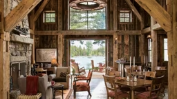
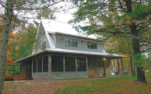
Marcelo Valdes, a designer with SALA Architects Inc. in Minneapolis, designed a 1,700-square-foot cottage on a northern Wisconsin lake, which he opened up to nature with a thoughtful selection of windows.
“Before you build you have to understand what point in nature you want to connect with,” he says. “Then think how. In this case there is a nice lake and also between the lake and cabin there is a forest with interesting trees. Trees create corridors of views.”
Valdes suggests spending time on the building site before designing a cabin in order to take in the views. The public rooms of a home, like the living room, dining room, family room or great room, should connect with the view, he says.
The Wisconsin cottage has a low-pitched roof that skirts around an A-frame. The bottom of the skirt, or first floor, is open toward the lake view. This is achieved through a screened porch on the left, a row of columns and wall of windows imitating the screened porch on the right. The second floor has a dormer on the back with small windows that focus on natural elements in the surrounding woods.
“There is this idea of opening up to nature on the lower level and opening up to views on the upper level,” Valdes explains.
The House That Went Up A Mountain
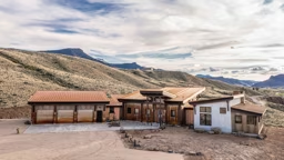
Culver City, Calif., architect Alejandro Ortiz took the idea of public and private space to extremes when he designed a ski cabin near Lake Tahoe. The cabin can be described as a modified A-frame because one leg of the A was dropped 15 percent. The result was two interlocking sections of the house – one going uphill and the other going downhill.
The approach to sizing and locating windows is distinctly different in each of the two portions of the cabin.
“The upper part of the house is where everyone gathers,” Ortiz says. “There is a great big living room with a pool table. The big windows in the living room give you the feel that you’re really out in the wilderness in touch with your direct surroundings.”
The upper part of the house has a window or door of the same proportion on every corner because Ortiz believes a designer should concentrate the window area where it counts.
The lower half of this mountain cabin is made up of five small bedrooms for guests and children. The emphasis here is on function, not style.
“We needed natural light and operable windows in each bedroom,” Ortiz says. “Some of the rooms are as small as 8 by 12 feet, and there was only one place where a window would make sense, so we didn’t worry about the outside as much.”
He says the homeowners wanted guests to have their own bedroom, but the bedrooms are just for sleeping and “no one ever hangs out in his or her room.”
Ortiz says looking out the living room windows in some mountain cabins gives him the feeling he’s on stilts. This cabin was designed to focus on the hill and make those inside feel like they are out in the wilderness right next to the trees.
Freelance writer Judy Serwe often pauses in her work to stare at the tree tops through a newly installed egress window in her DePere, Wis., home office.
WINDOW Do’s & Don’ts
Do consider the color. Traditionally, window frames have been limited to shades of white or brown. Today’s manufacturers offer a variety of colors. Forest green window frames look stunning with today’s log homes.
Don’t swing the wrong way. Casement style windows make opening and closing a snap, but make sure you don’t put them where someone could walk or run into an open widow. Patio doors now come in both in- and out-swing French door styles as well as sliders. If the room is small, don’t choose an in-swing door or you’ll be wasting valuable space when the door is open. Out-swing doors need deck room to open and close.
Do mix and match. The styles of windows available today are varied. So don’t be afraid to mix and match units. A casement window may work above your kitchen sink because it’s easy to open when reaching over the counter, but that doesn’t mean you can’t use double-hung windows in a nearby dining area. Combining shapes can be attractive too. Pirozzolo suggests combining a half-round or rectangular window with a double-hung or adding sidelights to increase the amount of light you bring into a room.
Don’t … do windows? If you’d rather spend your time staring out your windows from the couch than climbing on ladders cleaning them and changing out the storms every spring and fall, make low maintenance a priority. Some styles tilt in for easy cleaning. Most new windows do not require storms that have to be removed and stored in the warm months.
Do go for flexibility. Not sure you like your light divided? Some companies have windows with removable grilles.
Don’t waste energy. Check the energy efficiency (insulation value) of the windows as you window shop. Most windows today carry an insulation value of at least R-3 and often higher.
GLOSSARY Of Terms
Window Styles
Casement window: A window that opens from the side like a door.
Double-hung window: A window with two vertical operating sashes that glide up and down.
Single-hung window: A window with a fixed upper sash and moveable lower sash that slides vertically.
Slider window: A window with a sash or sashes that move horizontally.
Tilt window: A double-hung window designed so the sashes tilt inward for easy cleaning of both sides.
Window Anatomy
Casing: The trim around door and window openings. Interior casings are shaped and decorative pieces of molding cover the inside edges of the jambs and the rough opening between the window unit and the wall. Exterior casing is an alternative to brick molding.
Frame: The assembly (head, sill, jambs) used to fasten a window sash or a door panel to a structure.
Sash: The framework holding a glass in the window unit. Composed of stiles (sides) and rails (top and bottom).
Jambs: The parts of the window frame that make up the top, sides and bottom (sill) of a unit.
Sill: The horizontal bottom piece of a window frame.
Grille: Ornamental bars which don’t actually divide the panes of glass. Generally made of plastic or wood.
Pane: A single section of glass.
R-value: Refers to a window’s resistance to thermal transfer or heat flow. The higher the value, the better the insulation.
Double glazing: Two panes of glass separated by an airspace to form insulating glass.
To understand the appeal of great windows, imagine you’re in a cottage watching an early morning thunderstorm roll in over the lake through a bank of glass while you sip coffee in your favorite robe. Or trudging through snow and cold toward your cabin at twilight and feeling the welcoming glow emanating through the windowpanes.
A window should not be considered merely a functional hole in the cabin wall that provides views, light and ventilation. At its finest, a window is a visually pleasing design element, both in the interior and on the exterior.
But where do you begin? There are more choices available in windows today than ever before and the styles, sizes, shapes and frame color options can seem endless.
Considering the exterior design and qualities of your home is a good place to start. Because windows and doors are major architectural elements, you need to choose styles that match the design of your residence or vacation home, whether building or remodeling. Modern slider windows would not fit the look of a 1920s-style bungalow. Likewise, multipaned double-hung windows that would fit the style of a colonial would probably look out of place on a 1950s ranch.
There is no hard and fast rule when it comes to deciding how much window space to include in a home or cabin plan. Most people want their windows to provide adequate day lighting on even a cloudy day, but beyond that, the size and position of windows is determined by personal taste, budget, privacy needs and view.
Windows are an integral part of a cabin’s exterior design and they can make or break the mood of a room. Following are three different perspectives on choosing and placing cabin windows. All three designers agree that regardless of the style and location of a vacation home, its windows should connect the manmade structure to the natural world. How the windows accomplish that is what makes each cabin unique.
An Upside-Down House
Pioneering the concept of wanting the social rooms to have the view rather than the private rooms were the creators of the “upside-down” houses of Nantucket, says Dick Pirozzolo, spokesperson for Northeastern Log Homes and co–author of the book, “The Timberframe Way.”
“In a Nantucket upside-down house, the major living area with lots of glass is on the second story,” Pirozzolo explains. “The bedrooms are on the ground floor because when you are sleeping your eyes are shut anyway.”
If you are designing an upside-down house, Pirozzolo says there are certain things to consider. He suggests making the stairway wider than normal to give people something to look at when they walk in the front door.
“You want to focus people’s eyes upward toward the view rather than down at the clutter that sometimes accumulates by the front door like shoes, boots, umbrellas, mail, etc.,” he says. “Make it a grand entryway. You want to see glass and sky at the top of the staircase.”
Pirozzolo says from the outside, the heavily glassed second story of an upside-down house gives it a tree house feel because when you look out the large living-area windows, you are looking out into, or even over, the trees.
“You can take more liberties with a vacation home,” he says. “You can have normal windows on the first floor and grand windows on the second floor. Second story balconies are common too.”
 Marcelo Valdes, SALA Architects, Inc.
  Alejandro Ortiz, Alejandro Ortiz Architects
  Brian Vanden Brink/ Bullock and Company Log Homes


