Get ideas for your cabin kitchen remodel by checking out this project done in a cottage style.
By Fran Sigurdsson & Mark R. Johnson There are many ways to remodel a kitchen. If you’re satisfied with your current layout, you can simply work with your current footprint. On the other end of the spectrum, you can turn your layout on its ear while removing walls, soffits and more. Does a pint-sized cabin kitchen have you steaming? Before you go knocking down walls, consider Eric and Lori Lorenz’s kitchen update. The couple makes tracks for their retreat on Whitefish Lake, Wis., every chance they get. They gladly make the four-plus-hour drive from their home in greater Milwaukee because Whitefish teems with year-round outdoor fun. Whether snowmobiling or paddleboarding, Eric and Lori are sure to have a crowd in tow. In addition to their three grown children, the couple regularly hosts large gatherings of family, friends and church groups. But when mealtime came, the old existing kitchen peninsula led to bottlenecks. The Lorenzes sent an SOS to Anna and Jeff Burns of the design/build firm Brookwater Construction (Delafield, Wis.).
Before
The small, 9x10-foot, kitchen had just one entrance, and too many cooks rubbing elbows. Eric’s buddies – among them, chefs and restauranteurs – like to cook up a storm, especially in the winter when the stars on the weekend menu include elk stew or northern pike caught during the day’s ice-fishing expeditions.

Other woes: insufficient food prep and serving areas, recycle bins hogging floor space, a pantry inconveniently placed down the hall, and a hutch that hindered access to the dining table when all three table leaves were used. “The kitchen was cramped and the flow not conducive to large – or even small – groups,” recalls Anna.
After
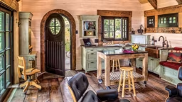
Replacing the peninsula with a two-tiered multitasking island was key to the remodel. Now, traffic flows around the island, and the fridge is easily accessible. Granite countertops on the lower tier flank the Jenn-Air range. Deep pull-out drawers store snacks, extra bread and fruit that guests bring. A raised granite overhang is perfect for predinner appetizers and drinks, as well as post-dinner wine and chocolate.

Three barstools also allow for kibitzing. “There’s usually a couple of guys cooking, and a couple saying what we’re doing wrong,” laughs Eric. Pull-out pantries on both sides of the fridge now maximize storage in what would otherwise be wasted space; all five shelves of cans and baking goods are visible when the handle is pulled. Recycle and waste containers are now corralled under the dining room window. A low counter conceals these new pull-out bins. This area also provides storage for seasonal serving dishes and glassware adjacent to the dining table, making the hutch unnecessary. Another bonus: The sleek granite counter makes the window a focal point. “Everyone thought we had added a much larger window,” says Eric, “but it’s the same one.”


The Lorenzes wanted to use as many natural materials as possible. To avoid fingerprints showing on the dark granite, the couple opted for a leathered finish that seals the pores and adds texture. “Hammered edges make it look rustic,” says Lori. The original wood-look laminate flooring was replaced with radial saw-cut red and white oak of varying lengths and widths. “The flooring gives a warm, old-world look,” says Lori. “We’ll vacuum, but it never looks dirty, even when people come with dogs.” Lighting was also greatly improved; eight schemes allow for different options. “Lighting design can make or break a project,” Jeff comments. “Now we have a terrific gathering space that exudes warmth and charm,” says Eric. Best of all, there’s no need to change out of swimsuits or miss sunsets to go out to eat; they can just stay at the cabin for meals.
Resources
Anna and Jeff Burns; The Brookwater Group, Delafield, Wis.; www.brookwaterbuilders.com
Longtime contributor Fran Sigurdsson covers cabin living from New York’s Adirondacks, while editor Mark Johnson is based in southeastern Wisconsin.
 Other woes: insufficient food prep and serving areas, recycle bins hogging floor space, a pantry inconveniently placed down the hall, and a hutch that hindered access to the dining table when all three table leaves were used. “The kitchen was cramped and the flow not conducive to large – or even small – groups,” recalls Anna.
 Three barstools also allow for kibitzing. “There’s usually a couple of guys cooking, and a couple saying what we’re doing wrong,” laughs Eric. Pull-out pantries on both sides of the fridge now maximize storage in what would otherwise be wasted space; all five shelves of cans and baking goods are visible when the handle is pulled. Recycle and waste containers are now corralled under the dining room window. A low counter conceals these new pull-out bins. This area also provides storage for seasonal serving dishes and glassware adjacent to the dining table, making the hutch unnecessary. Another bonus: The sleek granite counter makes the window a focal point. “Everyone thought we had added a much larger window,” says Eric, “but it’s the same one.”

 The Lorenzes wanted to use as many natural materials as possible. To avoid fingerprints showing on the dark granite, the couple opted for a leathered finish that seals the pores and adds texture. “Hammered edges make it look rustic,” says Lori. The original wood-look laminate flooring was replaced with radial saw-cut red and white oak of varying lengths and widths. “The flooring gives a warm, old-world look,” says Lori. “We’ll vacuum, but it never looks dirty, even when people come with dogs.” Lighting was also greatly improved; eight schemes allow for different options. “Lighting design can make or break a project,” Jeff comments. “Now we have a terrific gathering space that exudes warmth and charm,” says Eric. Best of all, there’s no need to change out of swimsuits or miss sunsets to go out to eat; they can just stay at the cabin for meals.


