The sweet spot
Perhaps the sweetest spot in the house for family gatherings is the screened-in porch, positioned with water on three sides to capture views and sun to the west, south and east. And with doors leading to it from inside the house and from decks on two sides, one could say it’s the heart of the cabin.
Now that two of the Kerrs’ grandchildren are old enough to attend summer camp on the lake, this porch is the perfect spot to watch for them. “There’s nothing like sitting out there and watching the grandkids canoe by our home and wave,” says Suzy.
Blending in with its surroundings
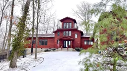
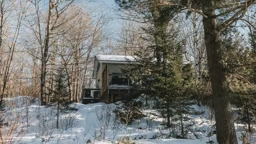
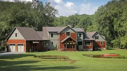
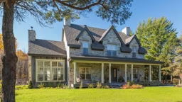
Much thought went into making the home visually friendly to those out on Lake Fairlee, as well. The center gable’s style echoes the region’s century-old architecture, with its classic dark-brown shingle exterior and green trim blending it into the property’s tall pines. Also, to minimize the impression of size, the rooflines were kept intentionally low. And, Suzy says, “From the water, one can never see both wings at the same time.” These extra efforts have been worth it. “We get so many nice comments from paddlers,” she says.
When it came to making the inside special, the Kerrs got some help from their builder, Chip Odell, who is “a man who knows a guy,” says Suzy. Through a series of special connections with hunters, woodsmen and collectors, Chip got hold of some hemlock flooring pulled from a classic New England Inn’s casino game room. This reclaimed wood is now laid throughout the Kerr’s home, giving it an organic feel, like the place has always been there.
Because the family was getting to the top of their budget, Chip had a great idea to save money on the bathroom vanity. By “beating up” pieces of pine board until they were distressed, the inexpensive wood fit right in with the rustic hemlock flooring. “It looks like he’d driven a snowcat over it,” says Suzy. “It’s perfect.”
“A story I love telling is about a bet placed by Chip on exactly when we’d notice the stonework,” says Suzy. Chip had convinced a skilled mason to come out of retirement to build the Kerr’s fireplace. Suzy admits, “It took us two months to notice the shapes of Vermont and New Hampshire laid in the fireplace – even after we spent so much time in the room painting all the walls ourselves!” And though the mason denies it, the Kerrs say they can clearly see his initials, L.E., in the stonework, too. “It was his last fireplace ever. Who can blame him?” Not the Kerrs.
Although she calls the Midwest her home today, Lucie Amundsen’s heart will always be in the bucolic small towns of New England she enjoyed during her childhood.
Click here to see floor plans for this cabin.
DESIGN RESOURCES
- Architects: Smith & Vansant Architects PC, Norwich, Vt., www.smithandvansant.com
- General Contractor: Chip Odell, Thetford, Vt.
- Interiors: DPF Design, White River Junction, Vt., www.dpfdesign.com
Many lake cabin owners around the U.S. organize lake associations. The Lake Fairlee Association, according to its mission statement, “is organized to protect and preserve the natural beauty of Lake Fairlee for current users and future generations.” Nearly all of the group’s funds pay for milfoil eradication on the lake.
Statewide in Vermont, there is the Federation of Vermont Lakes and Ponds (FOVLAP), which is comprised of about 40 local associations as well as 300 additional individuals interested in lake and pond preservation and promoting water-quality standards. In addition to keeping its members apprised of lake-related legislation, FOVLAP holds seminars and workshops on topics like:
- The best management practices to control erosion and nutrient runoff
- Boating rules and regulations
- Preventing the spread of aquatic invasive species, e.g. eurasian milfoil and zebra mussels.
It was right at the water’s edge of that kidney bean pie – also known as Passumpsic Point – that she and her husband, Gordon, purchased a rustic 800-square-foot cabin on the property of an old summer camp for boys. And while these primitive quarters had been passable for the two of them, augmented with a guest cabin, the Kerrs really wanted a vacation place suitable to host their children and grandchildren.
“It really was a funky old camp with no foundation and not intended for year-round use,” says the couple’s architect, Pi Smith. “It just wasn’t worth it.” So with the renovation dreams dashed, the team at Smith & Vansant Architects went to work designing the Kerrs’ new getaway.
And then came the phone call. “They’d decided to take this from a weekend cabin to a permanent residence for retirement,” says Pi. This changed everything.
The firm now needed to design on a bigger scale while still respecting the constants driving the project: The lakehome needed to be large enough for year-round living, but the Kerrs didn’t want a McMansion that would dominate the landscape.
“The old camp went right up on the shoreline, and for many reasons, I personally don’t think you should encroach the water,” says Suzy. That being said, the new place needed to make the most of its water views on a uniquely shaped property while shielding views of neighboring cabins.
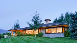
To satisfy all of these concerns, the house plan is roughly shaped like a V; its two wings have decks and porches on each side to capture the sunrise and sunset. At the center of the V is the main space for the Kerrs' year-round living, a two-story New England-style gable with a kitchen and dining room on the first floor and the master suite above it on a second level. A single-story living room makes up one wing of the V, capturing a stunning angled view of the water.
Back at the center of the V is the laundry room and a vestibule that flows into a surprising 15-foot breezeway, open to the elements. This is a pause before the last part of the home (finishing off the other wing) – a smaller guest area known as “the bunkhouse,” with a bedroom, den and bath.
This breezeway provides a buffer from noise and a side entrance into the home, while making the guest area truly a separate location that can be closed off when not in use. Another breezeway benefit is its inviting curb appeal. “When you drive up to the building, you see the water through the breezeway, so the building is a little bit porous feeling, not like a dam blocking off the lake,” says Pi.
Because really, no matter how lovely the cabin is, it’s all about the lake, right?
When designing, every effort was made to capitalize on views while making it easy to step out into them. And by keeping the living spaces as low to the lake as possible, while strategically orienting the main rooms to block views of neighboring homes, Pi’s design makes the Kerr lakehome feel like it’s entirely surrounded by water.
Pi explains that by setting the whole structure at an angle to the water, it took on unobstructed diagonal sightlines. “Every room in the house has a water view,” says Pi. And best of all, the new place allows the family to enjoy the sunrise on the east patio. “We didn’t even know we could see the sunrise on our property,” says Suzy. For views like these, the couple was willing to make some concessions. “I gave up a lot of cabinets for that view; I wanted the whole lakeside open to the water,” says Suzy.
Stepping out
Getting out to all this tempting scenery is easy in a home surrounded with a wraparound deck, a covered porch that cascades onto the stone terrace, and a sensational summer dining room. “All of these outdoor elements connect to each other with steps to everything,” says Pi, who used these open-air rooms to lure guests outdoors. This easy transition from indoor to out has really enhanced the way the Kerrs use their lake place.
8 TIPS FOR SITING A CABIN
There is quite an art to siting a cabin so that it takes full advantage of its setting. If you’re planning to build, rebuild or renovate, here are eight tips for siting a cabin from Ira Clark and John Vansant of Smith & Vansant Architects:
1. Prioritize outdoor living spaces on the site. Let them be shaped, in part, by the cabin. You will want easy flow from indoors to outdoors so these spaces get everyday use in the summer months.
2. Site the cabin so as to preserve key natural features. This will help it feel rooted in the landscape. Allow trees, boulders or other large elements to remain nearby for scale.
3. Consider views across and through the site. Don’t let the form of the house diminish your experience of the landscape, as you may spend a great deal of time outdoors. Consider the path you take when arriving, and make this a gracious experience. Align windows and interior axes with long views across water or meadows, views through openings in a forest surround, or appealing site features.
4. Consider seasonal prevailing winds, both for natural ventilation and in anticipation of the direction of oncoming storms. Take advantage of both sheltering evergreens in the direction of primary storm exposure and shading deciduous trees to the south and west.
5. Allow opportunities for western/sunset views, but don’t let western exposure dominate the floor plan, as overheating and glare can become issues indoors. Plot both summer and winter sunrises and sunsets on your site plan.
6. Open up the cabin to eastern and southern exposures to admit natural light during the cooler part of the day.
7. Consider surface and subsurface drainage as well as seasonal/tidal variations in water levels and flood elevations.
8. Isolate vehicle circulation, minimize their intrusion into view corridors and outdoor living spaces.


.jpg) Lake Fairlee Association
Lake Fairlee Association 


