Story by Sarah Pinneo
Photos by Rob Karosis
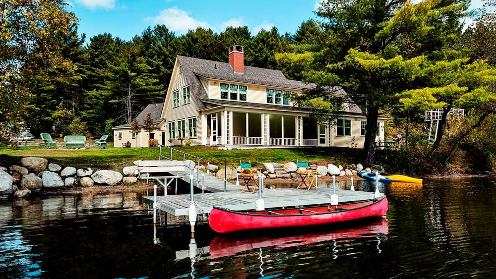
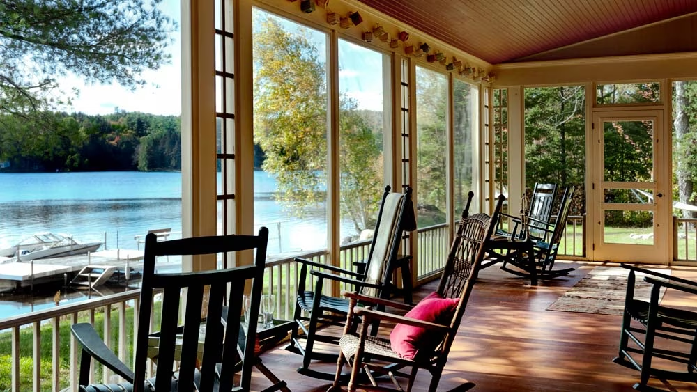
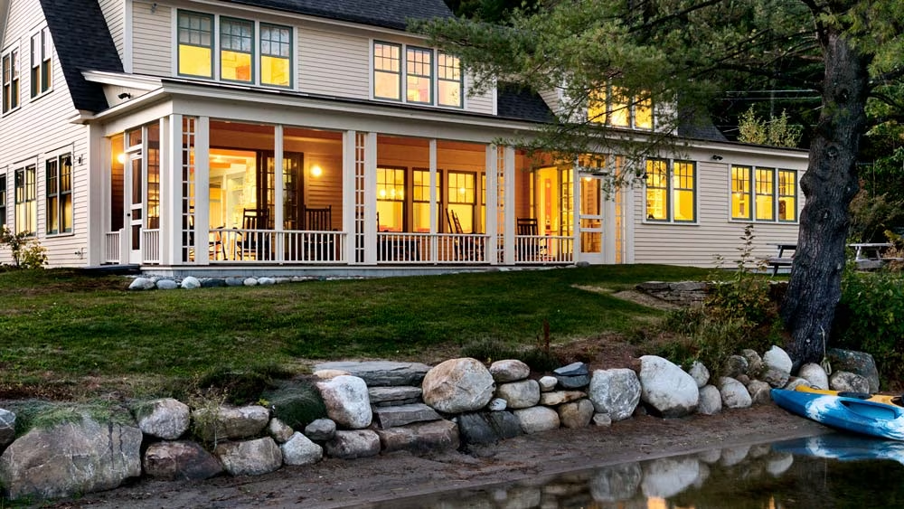
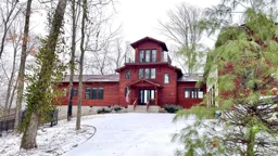
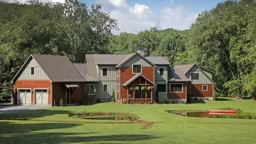
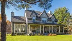
Driving west on a summer’s day along the edge of Vermont’s Lake Fairlee, the gables of a vintage camp house come into view. Although the road is paved now, the view is much the same as it appeared on a picture postcard from 1918. The same broad porch looks out on the lake, and the chimney still pokes from the center of the roofline.
However, as Mark Twain wrote, “You can’t depend on your eyes when your imagination is out of focus.” The house, which stands now on the pristine bank, is actually a clever reproduction of the old structure. “The comment we get most often is, ‘it looks like it’s always been there,’?” says Tom Porter of G.R. Porter & Sons Custom Builders. Porter was just one member of the meticulous team that built the “new old” home.
The Old Camp
John and Jeanette Freeman live and work on the West Coast during most of the year. They found this vintage camp house while searching for a Vermont lake place for summer recreation. John knew the area because he grew up 15 miles away, in Norwich, Vt. When they bought the place in 2002, people had been summering there for almost 100 years. They knew it as the Betty-Anne Inn.
In the 1930s, a bed could be had at the Betty-Anne Inn for $1.25 per night, including breakfast and lunch. With views of Lake Fairlee’s boating scene, the old camp house was a popular summertime destination. One advertisement promoted “hot water three days a week.” Another boasted: “A beautiful grove for your comfort, delightful scenery, and not too far from home. Come and see.”
When the Freemans purchased the place, many original details still survived. Yet for every charming feature there also seemed to be an equally vexing complication. “It was built as a seasonal camp,” explains architect Pi Smith, principal at Smith & Vansant Architects (SVA). “So there was no foundation instead of a slab, the framing of the house was built onto wooden piers and posts. The exterior was just clapboards on a wooden frame.” Many of the floors were severely warped, and the place had never been winterized. “You could open a kitchen cabinet and see daylight between the clapboards at the back,” recalls Jason Gaddis, project manager for SVA.
For all its quirks, the Freemans loved the old architectural details. They wrestled with plans to ren- ovate. “Having grown up in a house built in 1812 myself, we very much wanted to preserve the original cottage,” John Freeman recalls.
Nature Decides
Then, in August of 2007, Mother Nature made their decision easier. During a single storm, three big trees came down, one of which broke right over the house. The roof and the ridge beam were badly damaged.
“We’re biased towards being preservationists,” says builder Tom Porter. “But the house had significant structural problems.” A renovation would be cost prohibitive. In addition to its structural issues, the house had ancient electrical wiring and old plumbing.
“After assessing the situation with Smith & Vansant and the Porters, we realized that it was not possible to fulfill our family’s need with a simple renovation,” says Freeman. “So we decided to focus on preserving the spirit of the old house while giving ourselves the needed improvements.”
Recreating Vintage Appeal
So a new plan was born, one which would fool onlookers into thinking the old place had merely been fixed up. The new home would sit on the old footprint, yet enlarged by 20%.
With a great deal of planning and plenty of documentation, the character of the old place was recaptured. “We used the same roof pitches, the same gable,” explains Pi Smith. “We took pains to recover details, such as the eave returns.” The new house features a pair of replica columns, with latticework between them, adorning the porch. New window groupings are organized similarly to the old, and the chimney sits in the same location.
“So many people have said, ‘We’re glad you fixed it up.’?” Gaddis says with a grin.
Adding Modern Comforts
Starting from scratch freed up the architects to design a more modern layout which would simply not have been possible in a renovation.
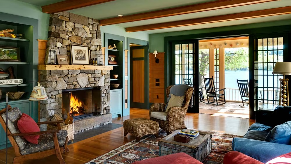
The living room, however, was recreated almost exactly – down to the cased wooden beams and the window pattern.
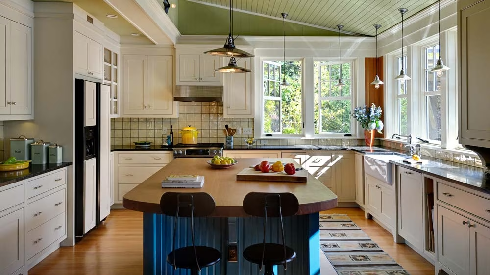
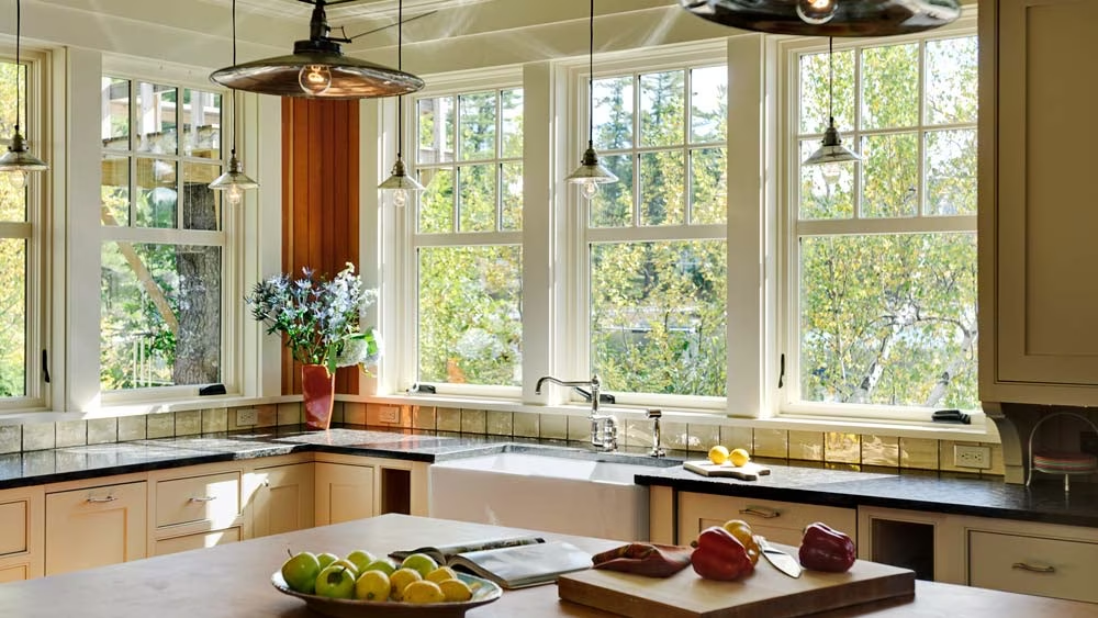
While old commercial buildings buried their kitchen near the road, a modern family wants to see the lake while they toss a salad. So the Freemans’ new kitchen has sweeping views of the lake, “and the feeling of being surrounded by glass,” Smith adds.
“The old floor plan was squirrelly,” adds Smith. “And the sequence of entering the house had not been well thought out.” The new version provides for a mudroom. And the location of the stair- case was adjusted, saving space.
The look and feel inside the new summer home is in keeping with the paneled aesthetic of the traditional, antique camp it replaced. Yet all the exposed wood and painted beams can make a house feel dark. So the new design includes a subtle lift of the ceiling height in the kitchen and on the porch. Fixed transom windows were added over several interior doors to pull more daylight into the rooms.
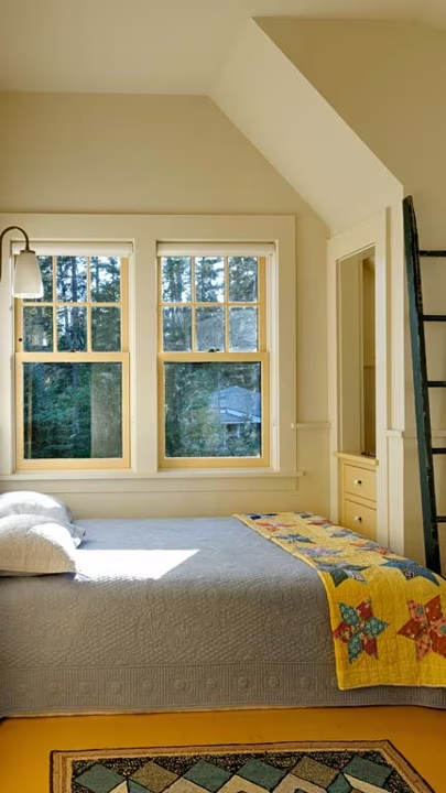
The plans also included design tweaks to add storage space. The bunkroom upstairs was rebuilt for the two Freeman children plus two guests. Each bedroom has new built-ins under the steepest parts of the roof line, “utilizing space that was wasted before,” Smith explains.
Everything Old is New Again
In service to the antique aesthetic, some of the old camp’s architectural features were repurposed for the new cottage. The upstairs hallway features seven old doors from the previous structure. And Smith went on to carry the same five-paneled theme into the new millwork downstairs.
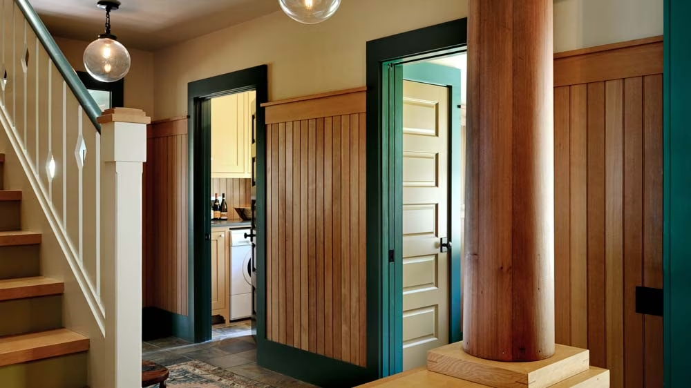
Another feature worth saving was the beautiful clear Douglas fir flooring found in part of the camp’s main level. But there weren’t enough decent floorboards to save. So the Freemans looked around for other salvaged fir boards, which proved elusive. “Until I found them on Craigslist in San Diego,” John Freeman remembers. “A salvager had taken down an old Michigan distillery from the 1880s, and a lot of board feet were available.” He had an entire train car load shipped to G.R. Porter & Sons millwork shop. That fir became flooring and wainscoting for the main level, as well as a top for the kitchen island and an eating bar in the kitchen.
Upstairs, the fir transitions to pine. Remember those trees which fell on the house? They were eastern white pine, which are commonly found in the area, and John Freeman saved them. “That’s typical of his sense of humor,” recalls builder Tom Porter. The fallen trees were transported to a sawmill and harvested into 1-inch rough boards. Porter milled them into flooring and wainscoting for the new home’s second level.
Charm That’s Accessible to All
In making the big decision to rebuild, one additional consideration helped tip the scales towards new construction. The Freemans needed to make the house accessible to a wheelchair-bound family member who would be a frequent visitor. Although the Freemans live in California during the winter months, John is a Vermont native, so he knew that many Lake Fairlee homes “were up and down a number of stairs. We actually bought this place sight unseen because of its level property.”
With a fresh design, the accessibility needs of the house became simpler to deal with. By the time the S&V team rolled up their sleeves on the Freeman house, Pi Smith had recently dealt with many of the same issues in her own home. “My father has mobility issues, and I had to deal with finding graceful ways of getting him in and out of my house.” And the Freeman family didn’t want just a single accessible door; they wanted for every door to be accessible. Smith was determined to execute a design which did not smack of bulky wheelchair ramps.
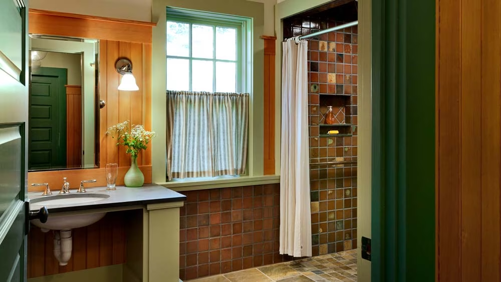
The result is so subtle that visitors to the house will not likely notice its accessibility. “The frame was actually sunk into the new concrete foundation,” not built on top of it. “We lowered the whole house down as close to grade as we could,” Smith says. A visitor with a wheelchair can roll right into any of the doors, around the kitchen island, and out onto the dock. The downstairs shower has a roll-in design. And the eating bar in the kitchen is comfortable at wheelchair height. Controls for the stove’s vent fan and light are on switches on the backsplash.
Coloring Between the Lines
Once the floor plan and structural details were all in place, it was time for the fun part – color.
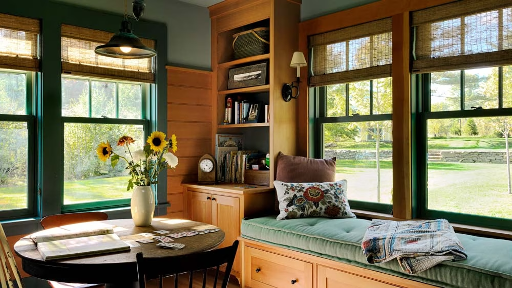
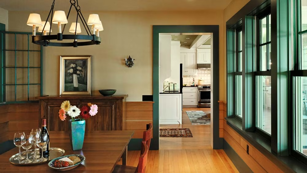
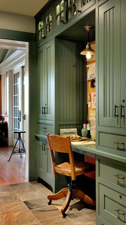
In the kitchen, living room and hallways, several shades of green make a nice contrast with the warm wood tones. “The green downstairs, along with the fir wainscoting, has the same look and feel that you can still see in the older camp buildings,” Smith says.
And while green is a traditional camp house choice, the Betty-Anne Inn had its own history of brightly colored rooms.
“My wife is a graphic designer, and great with color,” John Freeman says. “What are there, 33 different paint colors in the house?”
“Not that many,” his wife insists. With the assistance of designer Denise Welch-May of DPF Design in White River Junction, Vt., Jeanette Freeman chose an appealing palate reminiscent of the antique version of the house. During its days as an Inn, each bedroom had furniture painted in a distinctive color. The new design calls for each bedroom to have a different paint color on the floor – there is a red bedroom, set off with yellow window trim, as well as an orange room and a blue one.
“I generally like white,” says Jeanette, “but it just doesn’t feel right in Vermont.”
As with most home design projects, there was some compromise between husband and wife. “He liked the unpainted wood,” recalls Welch-May, “and Jeanette wanted more color.” In the final design, both were important. “We trimmed the fir wainscoting with painted wood,” or set a painted window frame into a paneled wall.
The result is a beautiful, thoughtful vacation home. Not every construction project faces so many tough decisions. But the Freemans are very happy with the end result. “Now we have a fantastic house for all seasons,” says John Freeman, “even if it took a falling tree to get us going.”
Cabin Stats
Originally built: Circa 1910
Rebuild: 2010
Location: Lake Fairlee, Vt.
Square feet: 3,500
Sarah Pinneo lives in the upper Connecticut River Valley with her family and an excessive amount of ski and hockey equipment. Sarah is also the author of “The Ski House Cookbook” and “Julia’s Child.”


